They say the Devil is in the details, and we couldn’t agree more.
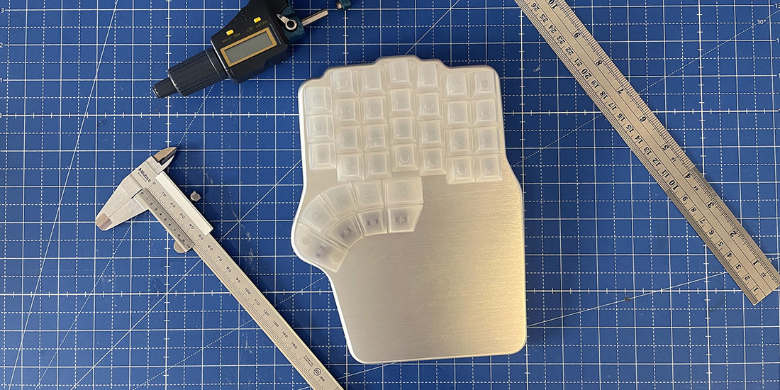
Getting the Defy ready for mass production has been a succession of tiny adjustments to every component. And by tiny, I mean so small that we have to measure them in microns (that’s 1/1000th of a millimeter) 🔬
So, take your magnifying glasses out and follow me through a tour of things you might not see at first glance, but our engineers swear that they are there 🔍
A fit body

If you recall from previous manufacturing updates, we had two main issues with the fitting of the body:
- The top panel was overhanging the base in some places
- The base was 500 microns (0.5 mm) thicker, so the mylar was not flush with the diffuser

For the first issue, we thought it was a problem with the top panel. But after getting a second revised sample and taking precise measurements, we realized that the problem wasn’t the top panel overhanging but the diffuser underhanging.
It turns out that the base is about 300 micros narrower than the intended design. And since the diffuser is placed around the base and forced into position by its shape, it wasn’t completely flush with the top panel 📐

In that drawing, you can also see the other problem.
We wanted our base to be 1.5 mm thick, but the first sample we got was around 2.0 mm. We fought with our supplier and made some changes to the design, but the lowest we could get was 1.8 mm 📏

That means two things: that the mylar that covers the base is still not flush with the diffuser and that the keyboard is 300 microns taller than we want.
The solution
Our supplier suggested clipping the diffuser into the base to solve the issue with the overhanging top panel. However, that affected the underglow light distribution, and it didn’t entirely solve the problem: the shape of the diffuser would still be determined by the shape of the base.

Ok, so why not just make the base wider? The issue is that plastic injection has some tolerances. So, if we added 300 micros and the tolerance went the wrong way, the base would be too wide and would need to bend to fit, thus making the keyboard wobble 👯♀️
The solution we found is adding about 150 microns to the width of the base, ensuring that it never would be too wide. Plus, we’re also making the diffuser 200 microns wider.
That way, the worst-case scenario is that the diffuser overhangs about 50 microns (0.05 mm), which is almost impossible to notice and much better than the top panel overhanging.

You can also see how we solved the issue with the base being thicker: we’ll increase the height of the diffuser by 300 microns. 200 should do it, but we want to ensure it’s flush or a bit thicker than the mylar.
Plus, we’ll shave 500 microns of the rubber legs. They were 1.5 mm, and now they will be just 1 mm. That way, we save some height, and the keyboard sits closer to the table.
With that solved, we continued looking closely, and we found a couple more issues 🕵️♀️
- There were some gaps between the diffuser and the top panel
- There were some sink marks in the base, where the Neuron is stored
The top panel gap

While inspecting the fitting of the base, we also noticed that, in some corners, the diffuser was not completely pressed against the top panel, so there was a gap between them.
Our supplier assured us that the diffuser was warped, but we believed that wasn’t the cause, as the diffuser is not rigid enough to push the base.

Our hypothesis was that the base was warped, and we were right. It was just a bit, but enough to generate that tiny gap. To prove it, we heated the base with a heat gun to make it completely flat, and the gap disappeared.
Now we are working with our supplier to ensure that all bases are flat.

The sink marks
Finally, we also had to deal with another minor complication derived from plastic injection: sink marks.

Sink marks are small craters or depressions when shrinkage occurs in the inner portions of the finished product, and we had one of those in the worst place possible: where the wireless Neuron is stored.
Our theory is that the sink mark is caused by a small recess on the other side of the base, which is designed to support the switch sockets of the main PCB.

We have redesigned that recess to make it less intricate, which should take care of the sink marks 🚫
A sturdy built-in tenting

Another thing that we are working hard on is making sure that the built-in tenting solution is exceptionally sturdy. We don’t want any wobble or flexing under any circumstance.
To ensure there’s no wobble, we’re tightening the hinges of all the rods and legs. That includes the main legs, the side legs, and the reverse tilting legs.

This was kind of planned. It’s normal to start with bigger clearances and then reduce them. It’s easier and more cost-effective to take material off the mold than to make it smaller.
What is driving us crazy is flexing. Under normal typing conditions, it’s unnoticeable, but if you press down hard on the top inner column, it’s there. You have to push with all your strength, but as I said, we want rock solid 💪

At first, we thought it was due to flexion on the side legs, which we are reinforcing with a more robust plastic mix. But even if we took those out of the equation, there was still some flexion under heavy load.
After a lot of testing, we realized it was the aluminum legs. We never thought they could flex, but they do. You have to apply a lot of pressure, and it’s almost invisible to the eye, but it triggers a chain reaction that causes that flexing when you press down hard on the top inner side of the keyboard.

We have already received new sample legs with an improved aluminum alloy, which we need to test. Either way, we have ordered more samples with different materials and manufacturing techniques to make sure it’s absolutely rock solid 🪨
The coolest colors in town

There’s no unit in the International System to measure the difference between colors, but if there were, we’d need the smallest one to compare the color top panels we received.
As you might know, we are making the Defy (and our other keyboard, the Raise) in Black, Silver, Royal Purple, Egyptian Gold, Atlantis Blue, and Daredevil Red 🖤🤍💜💛💙❤️

To achieve the perfect tone for each color, we sent our manufacturer examples of what we wanted the colors to look like, and they sent back some anodized random samples.
With those, we made some adjustments, and they prepared the first batch of color top panels for the Raise.
We liked the red and the gold, but the blue and the purple didn’t convince us, so we asked for more samples: a darker blue, a brighter light blue, and a darker purple —this time for the Defy.


It might be difficult to tell, but the sample to the right is slightly brighter, and we liked it better
We finally chose the brighter blue but disregarded the darker purple.
I must confess it’s difficult to tell them apart, but either way, they look fantastic: I can’t wait to get my Defy in Egyptian Gold.
However, the most crucial question is, how do you like them? What’s your favorite color of them all?

And on that colorful note, I’ll end this update.
As you see, the mechanical part of the Defy is making good, steady progress, and we’re now polishing ever finer details. We’ll be back in a couple of weeks with more news about the firmware & the electronics.
고맙습니다 🇰🇷


