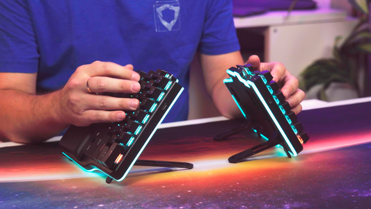
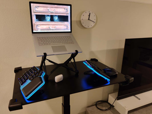
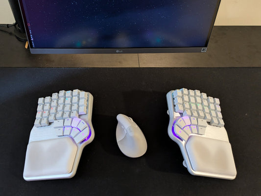
Since we received the first manufacturing samples of the Defy, one of our main goals was to make sure that the Dygma Defy built-in tenting was rock-solid 🗿
And after many iterations and ever-finer adjustments, we finally cracked it! 🎊
I’m not flexing 😎
In a recent manufacturing update, we explained how we had tightened the hinges of all the rods and legs, but we still got some flexion when pressing hard on the top inner column.

We thought it was the aluminum legs flexing under the load. But we tested stronger materials, and the problem didn’t go away 🧐
Fortunately, after scratching our heads for quite a few days and testing everything we could think of, we realized it was not a problem with the legs but with the base. The angle selector sank a bit when you pressed the leg hard, and that caused the whole keyboard to flex.

We changed the design of the base, so the angle selector was more rigid, and we’re now delighted with how sturdy and wobble-free it is. YAY!

There are still some micrometric adjustments to be made, though 📏
We’re reducing the gaps on the angle selector –so the leg snaps into place– and changing the rubber feet on the legs; the keyboard slides slightly on the two highest angles (45º and 60º).


Another thing that we’re going to change is the reverse tilting legs. They also flex a bit under heavy loads, and although you don’t notice when typing, we want to make sure everything feels robust 💪
Finally, I want to show you one little detail: we have added inscriptions to the angle selectors. That way, it’s easier to set up your tenting and reverse tilting —no second guessing.

We’ve even included instructions on how to combine both. Yes, we were able to make that work!
You can combine the 10º reverse-tilting with 5º and 15º tenting 🏕️

A case to travel in style 🧳
Another thing we’ve been working on the side is the travel case.
The design is based on the travel case for our other keyboard, the Dygma Raise, which was highly appreciated.
But, of course, we wanted to introduce a few key improvements 😅

- Now there are two colors –black and grey– that match the black and silver keyboards.
- The interior lining is now made of suede, which looks and feels nicer and protects the keyboard better.
- We added two humps to keep the keyboard in place even if the box is tossed around.
- The slot for the Neuron is compatible with wireless and wired Neurons.
You’d say that seems like an easy task. But no. It has taken us four iterations to get the case just right 🙈

The first sample had several issues: the pocket for the cables was not big enough to fit them all, and, on top of that, the stitching was leaving a mark on the palm pads. We had issues with the humps –they were not keeping the keyboard properly tucked in– and the wireless Neuron was too loose on its slot.

For the second sample, we fixed the problems with the humps and made the cable pocket bigger, following the shape of the palm pads. However, we made a design error, and it was still pressing the palm pads. To top it all, the supplier didn’t follow our instructions, and they didn’t fix the Neuron slot.

In the third sample, we finally got the shape of the pocket right, and we added some nets to store the cables. We also tried a hidden hinge for the pocket lid, but we didn’t like it. If you put too many things in the pocket, it would pop out a bit.
So, we returned to the original hinge design and called it a day 👍

We haven’t finished yet, though. We’re still working on the cables’ packaging. They will be nicely wrapped in small paper straps –similar to how they come when you buy a smartphone.
Here are a couple of pictures of a test with the straps in place and showing the bag of “prototypes” so you get the idea of how many we tried 😂

The enhancement kit 💥
Your Dygma Defy won’t travel alone in the box. The Enhancement Kit keeps it company 🤗
The enhancement kit is a little box that contains the test switches, a large cleaning cloth, the keycap and switch puller, the brush (aka, crap remover), and two sets of thick and thin O-rings.

Although it’s not essential to the experience, much care has gone into its design 💝
For example, the color and finish of the box on the first sample didn’t convince us. The black wasn’t as black, and the letters were more off-white than true white, making them less sharp.
The second sample, which is from a different supplier, was much more convincing, with sharp legends and an evenly black surface. Classic and elegant🤵

On the inside, we had to make some minor adjustments to the foam’s perforations, but otherwise, everything is neatly organized, with nice translucent boxes for the cloth and the O-rings.
And that is all for now!
If you have any questions or want us to show something in particular, please leave a comment in the update. And you can also join the live Q&A we’re hosting today, November 3rd, on Youtube, which you can watch afterward if you miss it ⏯️
Snakkes snart 🇳🇴


