Look at your hands while typing. Do you see anything weird? No? Let me give you a hint: look at your thumbs. That’s right, We use both thumbs to press ONE SINGLE KEY, the space bar, while your little pinkie finger is in charge of more than a dozen keys!!

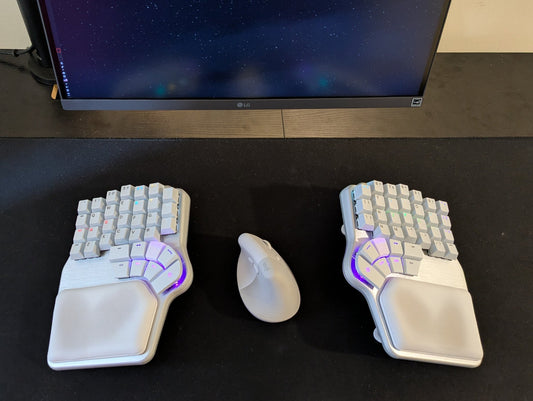
But what if I told you there’s a keyboard with 16 keys for your thumbs? Yes, you heard right. 16 keys. I’m sure your pinkie will be happy.
The thumbs have a completely different range of movements than the rest of our fingers.
The real challenge is designing keys that suit those movements. And to solve this challenge, you must research how others have tried to solve it in the past.
If you’d like to watch our video about this story, check it out below:
Research
Looking back at the dawn of ergonomic keyboards in the ’70s, we can distinguish two different “schools” of design. We call them the “thumb block” and the “thumb curve”.
Introduced by Malton in 1977, the thumb block tends to have keys arranged in large clusters with several rows. The idea behind this design is to have a lot of keys close to the thumb in hopes that the user finds the ones that fit them best.

On the other hand, the thumb curve, first used by NEC in 1983, is a small cluster of keys following the natural arch of the thumb.

These designs have inspired some of the most beloved keyboards to this day.
Maltron’s thumb block can be found in keyboards such as the Kinesis Advantage, the Ergodox, or the Moonlander. While the NEC thumb curve has left its imprint on keyboards such as the Tron, the Esrille, the Keyboardio models, the Kyria, and the Iris.
Each approach has its pros and cons.
Thumb Block
- Pros: The thumb block has more keys.
- Cons: Not all of them are in optimal positions, so only 2 or 3 tend to be easily accessible. Plus, it was designed for concave key wells, so when used on flat keyboards (like the Ergodox), the natural rest position of the thumb is not on the thumb cluster but the empty space between the cluster and the rest of the keys.
Thumb Curve
- Pros: all the keys are easily accessible, as their placement follows the natural movement of the thumbs.
- Cons: it has fewer keys. Early designs had about 3 or 4 per side.
So, what if we could develop a design that got the best of both? A curved thumb cluster with many comfortable keys to go around.
The rule of thumb
But that raised the question: what is comfort?
How can we measure it? And most importantly, how can we know where to place the thumb keys to achieve optimal comfort?
Luckily for us, there have been several studies regarding the topic. To get a general idea, we can use The Effort Grid, which measures how comfortable it is for us to reach the different keys on a keyboard.

As expected, when we move further away from the home row, the effort to reach the keys increases, and that’s one of the reasons neither the Raise nor the Defy has F keys.
This was valuable information, but not enough for us. If we were to make the most spectacular thumb cluster, we needed specific info in that regard.
We conducted as many tests as possible to better grasp how far you can comfortably hit a key with your thumb. We discovered a few interesting things about how different conditions of the user affect the effort matrix:
- Larger hands could reach farther out, while smaller hands reached inner positions better
- The flexibility of your thumb affects how comfortably you can reach the inner keys.
- How we place our fingers on the keyboard has a noticeable impact on the comfort of the thumb cluster.
- If you lay your fingers flat on the keyboard, your thumbs will command a bigger area.
- With a claw grip, you’ll easily reach higher rows (like the number row), but your thumbs will have a reduced area of influence.
- Finally, how you position your hand affects the arch of the thumb. If tilted inward, you’ll have better access to the outer area. If you have them aligned with the keyboard, you’ll reach the inner positions more comfortably.
As a result, we had a heat map of where we needed to place the thumb keys so most people could use a good amount of them.

The pinkie connection
When developing the Shortcut –the first keyboard we designed but never released– we realized how much the pinkie and the thumb are connected.
If you think about it, we’re making our smallest finger hit a lot of keys that are difficult to reach. And it can’t keep up.
So, whenever we have to press a faraway key with the pinkie, we tend to move the whole hand, and subsequently, we move the thumb away from the cluster.

We also discovered that every time we changed the pinkie stagger, the arch of our thumb was different. The more aggressive the pinkie stagger, the flatter the arch, and vice-versa.
This is very important to remember: every time you adjust the layout, you must reposition the thumb cluster.
All that research made us realize several things:
-
The keys on a curved thumb cluster are easier to reach as they follow the natural arch of the thumb.
-
The thumb has quite a big area of influence, although it varies depending on the size and position of your hand and the flexibility of your thumb.
-
The position of the thumb cluster is heavily intertwined with the layout, especially the pinkie stagger and how far the pinkie has to stretch to reach far-away keys.

With all that in mind, we developed our theoretical model of what the best thumb cluster would be:
- We would use the thumb curve model but try to add a second row of keys to make the most of the thumb’s range of movement.
- We would eliminate the keys that the pinkie couldn’t reach without moving the hand. That includes the outer columns and the modifier row.
- We would explore different pinkie staggers in combination with the thumb cluster.
- We wanted every user to easily reach at least 4 or 5 keys, even if that meant having a bigger thumb cluster with keys not everybody would frequently use.
- But, at the same time, all the keys should be easily distinguishable from each other.
Well, all the theoretical jobs had been done. Now it was time to get greasy and messy.
Conceptual approach

These early prototypes are a rough approach to confirm that we were on the right track with our theoretical model.
We wanted to iterate fast and easily, so we didn’t think too much about the shape or aesthetics of the keyboard, just the layout and the thumb cluster.
Our main hypothesis is that a curved thumb cluster works with two rows of keys. If the bottom row is lower than the top row (using low profile switches and keycaps, like in the Raise) it’s quite easy to reach and press both.
We also experimented with aggressively staggering the column left A (Prototype B) as we thought it would be more comfortable to reach, but it wasn’t. You can see in this other prototype (Prototype A) that both columns have the same height.
Finally, we also realized that there was space on the inner side of the keyboard to add an extra column.
Prototypes 1 & 2

With the early prototypes, we confirmed that our thumb cluster could work, but now we had to start fine-tuning it.
We identified that different hand sizes easily reached different thumb keys. So we created a sliding mechanism to be able to test multiple potential positions for the thumb cluster quickly (Prototype 1)
The first prototypes had 7 keys, but we thought we’d be capable of having 8 without compromising the user experience.
To be able to do that, we started experimenting with the shape of the keycaps and the separations between them. You can see that on the next prototype (Prototype 2), the keys are more like a pyramid, so there’s more space between them on the top. That makes it easier to press them individually.
On a side note, on this prototype, we also removed the outer column in the layout. We found those keys difficult to reach with our pinkie without moving the hand –and we wanted to avoid that at all costs because it made our thumb move away from the thumb cluster. Plus, it also gave the keyboard a weird shape, like a Baseball glove.
Prototypes 3 & 4

We were convinced we could make 8 keys work, with 5 of them in the top row, so we went all in with this approach. We thought if we made the keycaps smaller, we’d be able to place the switches closer, making it easier to move your thumb around. We experimented with a bunch of different angles and edges for the keycaps on our 3rd Prototype.
In the end, however, we realized they were just too small.
So we made a new iteration, following the previous trend of round keycaps but taking more space (Prototype 4). The dimensions for the keycaps were fine, but the shape was just not quite right, so we began developing different shaped keycaps.

We tested a couple of dozen solutions with one main hypothesis in mind: the smaller and further apart from each other, the easier it would be to distinguish from each other and hit comfortably. But it turns out we were wrong, or at least we overdid it. So we went back to bigger keys.
Prototype 5

We were a bit stuck, so in the next prototype, we tried a couple of things:
We made small changes to the A and F columns, reducing the stagger. Those two columns are quite important, as they set the hand's position on the keyboard and, thus, the arch of the thumb. With this change, the inner keys were now easier to reach.
Another hypothesis we had is that a thinner top row would make reaching the bottom row easier. And it did!
However, with thin keys, you could see the switch underneath them, so it was quite weird, and we disregarded it.
Another issue we were facing was that you needed to have your thumb extended to reach the outer keys. And with your thumb extended, you’re not so precise, so it was difficult to hit the top one without hitting the bottom one. And hitting the lower one was pretty uncomfortable too.
We always had a clear approach: more is more, but what if that was not true? what if the solution was merging those two new keys into one?
And it worked.
Now you didn’t need to be precise or contort your hands to reach the outermost key. Or the tip, as we call it.
And, in the end, we didn’t lose any keys. We just made the outermost key bigger and the bottom three smaller.
Prototype 6

We were satisfied with the solution that we were creating the curved thumb cluster, but a long time ago, a Raise customer suggested creating a thumb cluster that included an extra key underneath.
The thumb keys were composed of a Cherry stem switch, a low profile switch, and a laptop switch, which creates 3 levels. And although it wasn’t the most comfortable, we recognized there was value in this concept, but we decided to move away from this concept for a few reasons;
- Laptop switches are not very comfortable
- We already had problems making two rows work
- It was looking more like a thumb block
- It only had 5 keys instead of 8.
Prototypes 7 to 9
These are the final prototypes before moving onto the final design for the Defy.

However, we still had a few challenges to fulfill.
When you type with a claw grip and hit the thumb keys, your thumb goes over the keycap, meaning it could accidentally click the key above. In addition, having 4 keys on the inner column meant the highest one was hard to reach.
This meant we couldn’t have 4 keys on the furthest inner column. We also tested the concept with 2 keycaps, as you’ve seen in our earlier prototypes, but realized 3 were fine.
Next, we started experimenting with the aesthetics, as you can see in the samples below, we tried changing the dimensions of the cluster as well as the angles and shapes of the individual keys.

But there was 1 key that drove us nuts.

This is the keycap we spent the most time deciphering how best to place.
The issue was that when sliding over from the bigger keycap on the right, you’d hit a wall, and it would not be a natural flow for your thumbs.
Our challenge was to create the perfect curve and slope that would allow your thumb to slide across the entire cluster without any walls or clippings.
After dozens of 3d printed models, we eventually perfected this curve, and the results look great.
Final Design
The final design of the thumb cluster has eight keys on each side: 4 in the top row, 3 in the bottom row, and one in the tip. The top ones use regular switches, and the lower ones and the tip use low-profile switches.
We tested the design with many users to ensure we accomplished our main goal: that everybody could reach at least four or five keys comfortably, regardless of their hand size, the flexibility of their thumbs, or how they place their hand on the keyboard.

Maybe the inner ones are less accessible -unless you have really flexible thumbs- but the idea is that you use the most comfortable keys for frequent actions, such as Enter, Space, Backspaces, Modifiers, Layer Switching… and the rest for other functions, like macros or combos.
With so many keys, the possibilities are endless, and we are eager to see what you can create with this amazing cluster.


